
A short blogpost written during the pandemic.
Like any complex matter of public concern, the discourse around the COVID pandemic relies heavily on visual information. Over the past months, many iconic visualizations have emerged in the popular discussion. National newspapers explain the interpretation of logarithmic scales and weigh the pros and cons of absolute and relative measures. In this brief post, I want to examine a type of visualization that has received less attention despite its popular resonance: the material visualizations examining the modes of viral contagion.
The visualizations shared online during the pandemic fall into three categories. Most frequently, we find scientific visualizations, including the various portraits of the virus: colorized microscope images or stylized computer renderings of its molecular structure. They provide mental images for an invisible threat but are also a testament to the practical impossibility of publishing an article without a leading picture. The second group includes data visualizations of epidemiological data plotting number of cases and their geographic distributions captured in characteristic curves. The infamous “flatten the curve” chart falls between the two categories—it is an idealized data visualization not based on actual data that conveys a concept. But in this post, I am interested in a third category that I describe as autographic visualizations. Such autographic visualizations convey material information, often as the results of visual experiments. While data visualization uses visual marks such as point and line symbols, the visual marks of autographic visualization are physical traces. Through these traces, a phenomenon becomes its own visualization. A few examples will make it clear:
Medical technician Katie Corley coughed on two Petri dishes filled with a blood agar medium. For the first one, she wore a cloth mask; for the second, she did not. She displayed the results on her Facebook page after an incubation period of 20 hours. The dish exposed without a mask showed an impressive amount of bacteria cultures, while the other dish remained virtually unchanged. Katie concludes: “maybe cloth masks don’t give you much protection, but they protect the people around you.”

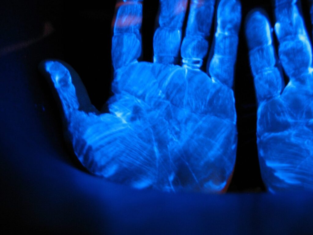
The Japanese national broadcasting organization NHK published a short video presenting an intriguing experiment investigating the potential spread of bacteria through surface contact. A group of diners gathers in a room set up like a buffet restaurant. One of the subjects received a drop of a gel on his hand—a specific substance that fluoresces under UV light but is otherwise invisible. After the meal, the room is illuminated with UV blacklight, showing many persons and objects in the room covered in fluorescent traces of the gel, contaminated by touching and social interaction with a single “infected” individual.
Flourescent gels such as Glo Germ are frequently used in simulations and training scenarios for working in contagious environments. Patrick G Hughes from Florida Atlantic university used it for training proper procedures for taking off PPE equipment such as caps, gowns, masks and face shields. These experiments also reveal how often we touch our face.
The American television show Good Morning America (GMA) used a simpler variation of this approach, examining the effectiveness of different hand-washing techniques. The video’s subject replaced soap with black paint to demonstrate that the conventional way of washing only affects a small part of the hands. The color is a simple mean to show how many steps are necessary until all surfaces of the hands are thoroughly cleaned.GMA hand washing experiment. Source
The question of how far the droplets exhaled by an infected subject can travel through air is still a significant source of uncertainty about the pandemic. A range of popular videos visualize the spread of exhaled air, when breathing, talking, sneezing, coughing, with and without a mask. The most common method is known as Schlieren imaging, an optical technique that can reveal differences in the density of air subtle enough to capture slight movements of air, thermal turbulences, and sound waves.
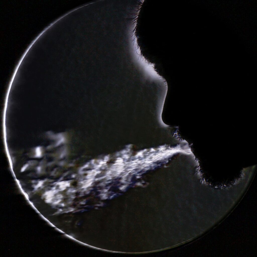
LaVision imaging of coughing with and without mask. Source
These four examples stand for a larger group of visualizations aiming to settle debates such as “Should we wear masks?” by showing instead of explaining. They are popular because they reveal something surprising, offer tangible images of an invisible process that may otherwise feel abstract. We assume our body ends at the boundary of the skin — we move through the world like fish through water, leaving no trace. The visualizations show an alarming different image — we contaminate our environment with every breath and every touch; leave our traces everywhere. Conversely, the outside world reaches deep into our body, brings in particles from the outside.
Such “viral” visualizations share historical parallels with the spectacular public experiments of the enlightenment period, which introduced a broad audience to phenomena such as electricity and magnetism. Both are concerned with scientific phenomena but are rooted in popular culture, presented by amateur experimenters and science enthusiasts. What can visualization enthusiasts learn from such experiments? They share a central concern with data visualization — showing instead of explaining, preferably of reliable facts. They use similar methods of visual explanation, with the principal difference that they apply to material rather than symbolic data. In the framework of autographic visualization, I describe these methods as a set of design operations that focus on revealing physical traces.
The design operations of autographic visualization involve defining a visual space, choosing appropriate marks, and guide the interpretation through annotations and encoded scales. The four examples use these design operations in different ways. All use framing to define a visual space around a specific aspect of the phenomenon: the contagion through breath, touch, or spatial proximity. Katie Corley uses bacteria as a proxy for the invisible agents distributed by human breath. The medium of nutrients in her petri dishes allow bacteria to grow, using the design operation of aggregation to amplify an invisible phenomenon until it is large enough to cross the threshold of perception. NHK and Good Morning America use design operations of trace making to create visible traces of an invisible process, using paint as a tracer substance that creates permanent visual traces of the processes. Schlieren imaging is another form of trace-making, coupling the phenomenon of exhalation with an apparatus that makes it visible. All of the experiments allow some form of measurement, such as comparing the amount of bacterial cultures, counting traces of touch.
Autographic visualization addresses a blind spot of data visualization. The latter reveals patterns in data but does not convey the material circumstances of data capture. Many controversies are precisely about these circumstances: how testing is implemented, which deaths are counted, which distortions and assumptions result from a particular data collection approach. Autographic visualization is about the process of data collection. Data collection is typically considered the “boring part” while visualization and pattern analysis is the part where things get interesting. Autographic visualization, in contrast, looks at data collection as a sensory and visual process, the aesthetic production of evidence.
Evidence is the operative term. Katie Corley directly addresses “conspiracy theorists,” suggesting“Maybe wear [a mask] if you insist it’s your constitutional right to eat at Chili’s.” Even material evidence, however, is rarely uncontroversial. As the comments on her Facebook post show, details and implications of her experiment (e.g. the different size between a virus and a bacterium) are questioned and debated, prompting her to expand her post and clarify details. Many comments are constructive and add new facets to the discussion. A commenter on the Schlieren video pointed out that the phenomenon can also be visualized by exhaling in cold air. Like charts and graphs, autographic visualizations are carefully framed presentations that involve persuasion and rhetorics. Material traces are “objective” in the sense that they are object-like products of causality. But the construction of evidence remains a social process that involves presenting, interpreting, and convincing. But while disagreements about data visualizations often remain unresolved due to the outright dismissal of a data source, controversies around physical traces are grounded in a tangible and visible phenomenon. This does not make them less prone to disagreements, but can take the debate further by overcoming some of data visualization’s blind spots.