
Summary of my 2019 paper at IEEE VIS 2019, originally written for Multiple Views: Visualization Research Explained.
Following
- The framework of autographic visualization starts with the question: how would visualization practice look like if we consider data not as something abstract, but as something material?
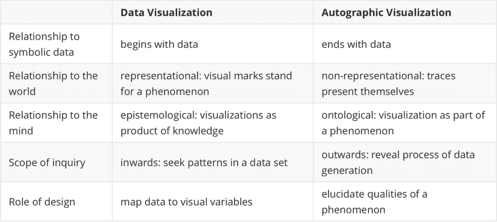
- Data visualization begins once data exists; the process of data collection remains mostly hidden. Autographic visualization starts with physical phenomena and ends with data.
- Autographic visualization is a set of design operations that focus on revealing physical traces to make the process of data collection more legible and accountable.
Introduction
Data visualization has a seemingly trivial limitation: it can only begin once data exist. Once data exist, however, the material processes and conditions of their collection tend to be forgotten.
Many public controversies — about the nature of climate change, the implications of environmental pollution, or polls in a presidential election — are about how these datasets were collected; whether they are trustworthy and accurately represent the phenomena they describe. While the methods of data visualization excel at revealing patterns in data, they are less useful for addressing methodological debates about the nature and origins of data.
Data visualization is based on the concept of data as abstract symbolic representations of some phenomenon. This conceptual model is so ubiquitous that we take it for granted. But there are alternative models beyond symbolic representation. Archaeologists think about artifacts buried in the ground as data; geologists consider the geological strata as an archival record whose arrangements express a temporal order. In these examples, a datum does not represent anything; it is a thing in the world. Taking such an ontological perspective makes it easier to talk about how data relate to phenomena in the world.
The framework of autographic visualization starts with the question: how would visualization practice look like if we consider data not as something abstract, but as something material? Could we come up with more compelling and insightful visualizations of, say, climate change, when our data comprise the layers of ice cores, the increasing number of sub-tropical insects that make it into the northern regions, or the increasing damage to plants based on ground-level ozone? Once we think about data as something physical, we see visualizations everywhere in our environment. Tree rings, the desire lines across patches of grass in the city, patterns of wear on statues and door handles, skid-marks from tires on the road. The framework evolved out of earlier work based on Peircean indexicality, developed together with Orkan Telhan. Dan Lockton et al.’s concept of qualitative displays explores related phenomena from an interaction design perspective. Yvonne Yansen and Pierre Dragicevic’s framework of data physicalization has opened new ways of thinking about visualization and materiality. In contrast to physicalization, however, autographic visualization is not a display modality — it is concerned the fundamental underpinnings of data collection.
Introducing autographic visualization
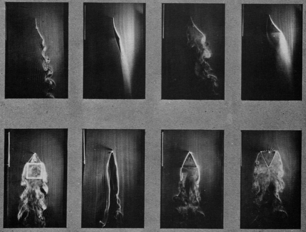
Autographic visualization is a set of techniques for revealing visible traces and guiding their interpretation. Instead of mapping data to visual variables, the designer sets the conditions that allow a trace to emerge. A trace represents nothing, it merely presents itself. This is what the word autographic means: self-inscribing. A phenomenon becomes its own visualization. Autographic or self-registering devices are not new: they have been in common use since the 19th century. As described under his graphical method, Étienne Jules Marey understood the visualization of statistical data and the construction of autographic devices as two aspects of the same discipline. Among his many inventions, he built photographic cameras to study the flight of birds, wearable devices that record the human pulse, and a wind tunnel to visualize the turbulent movement of air.
The production and interpretation of traces is central to many areas of knowledge production. The systematic study of environmental information, such as animal tracks by hunters or cloud formations by navigators, is as old as humanity. The history of experimental sciences is full of ingenious examples of self-registering devices that translate a phenomenon into a characteristic trace under controlled conditions. Forensic sciences, medicine, and microbiology have developed a range of methods for revealing and visualizing imperceptibly small material traces. In everyday life, we take an abundance of environmental clues into account without thinking much about it. Considering that traces play such a central role in so many areas, it is surprising that design theory has very little to say about how to reveal, prepare, and produce traces. The paper is an attempt to formulate and systematize the design operations involved in visualizing traces, based on a diverse set of literatures, from the history of science to anthropology and the philosophy of information.
What is the relationship between infovis and autographic visualization?
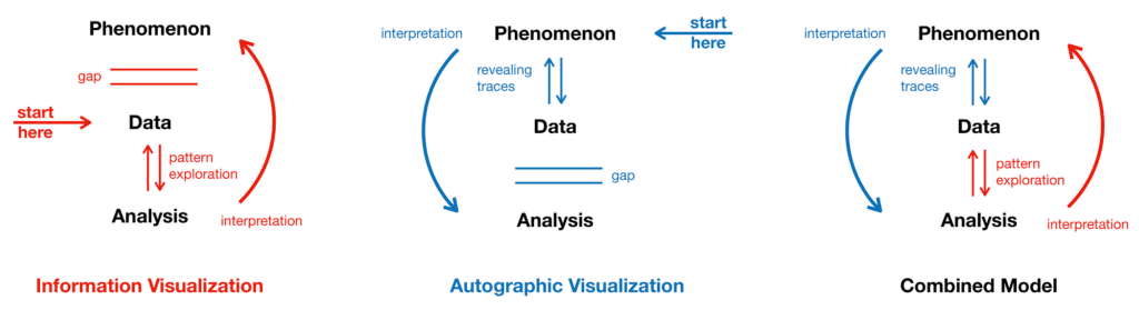
We can summarize the difference: In infovis, we start with a data set, looking for patterns to interpret a phenomenon the data set supposedly describes. But we don’t see the exact relationship between data and phenomenon, a gap separates them. Autographic visualization starts with a phenomenon and focuses on the process how traces become data to better understand the data collection process. We encounter a second gap, because computational analysis can do many things that cannot be done with material traces. A combined model contextualizes digital data with relevant material phenomena to make data collection more legible and accountable.
The design operations of autographic visualization
A classification of traces is impossible because literally anything in the world can become a trace in some particular context. However, it is more productive to think about autographic visualization less as a thing and more as a practice. To find, reveal, and preserve a trace involves a range of different design operations. This autographic visualization “pipeline” can be separated into four steps. It starts with a material phenomenon that we are interested in and ends with a configuration of traces that can be readily encoded into a data set.
1. Establishing perceptual context
In an environment where everything carries information, it is important to isolate the phenomenon from everything not of interest. This first step is about establishing a perceptual context — setting the stage on which the phenomenon presents itself. It may not involve any material intervention; sometimes it is just a certain technique of observation, listening, or feeling.
Framing
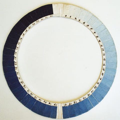
Framing is a ubiquitous concept in communication theory, but it also can be taken literally — putting a frame around the phenomenon of interest. It includes any design intervention that offers guidance on how to observe and interpret a material phenomenon. The cyanometer, a historical device for measuring the blueness of the sky is a circular disk with a hole in the center and a graduated color scale at its perimeter. The frame separates the sky’s color from its surroundings and simultaneously establishes a new context for comparison and measurement.
Constraining
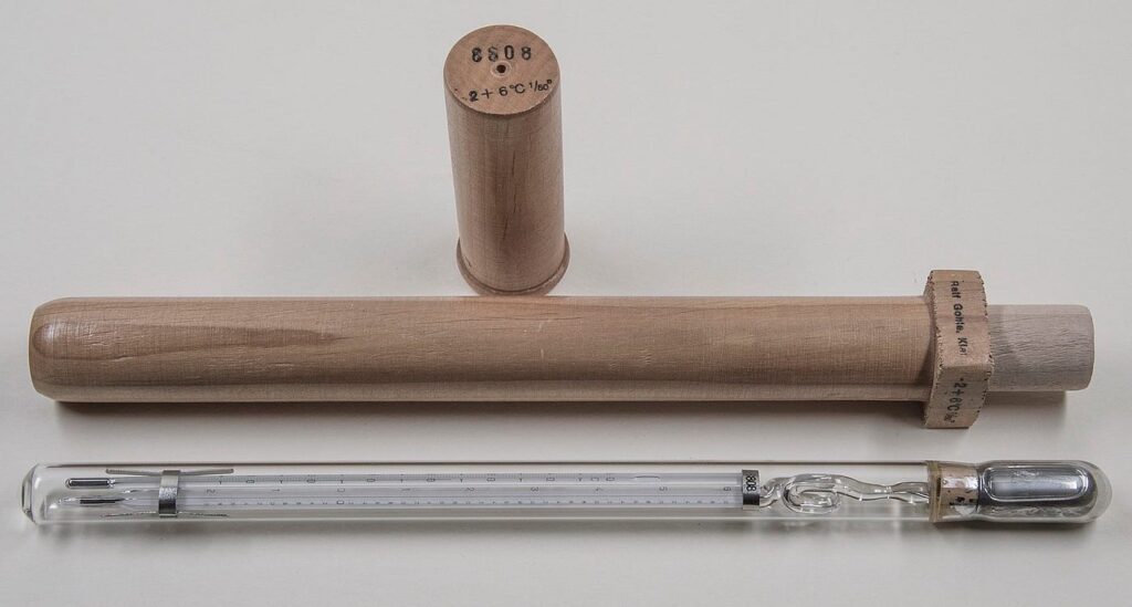
Constraining requires more intervention; it involves physically affecting the phenomenon. Like framing, constraining isolates a particular aspect of a phenomenon, but unlike framing it does so by reducing the degrees of freedom. The mercury thermometer constrains the liquid metal into a glass tube to allow the observation of its thermal expansion, but it does not affect other qualities such as its color.
Equivalents in data visualization:
The choice of a chart type, layout algorithm, or metric scale are equivalent ways of establishing a visual context for observation. The selection of variables, the filtering or highlighting of certain data points are examples of framing and constraining a data set.
2. Tuning Scale & Configuration
Some phenomena have inherently visual properties, but cannot be perceived because they are too dispersed, too slow, too large, or too commingled. A range of design operations aim at adjusting the intensity and configuration of a phenomenon so we can observe it.
Aggregating
Most natural records such as tree rings, sediments, or patina are aggregations of material over time — the results of imperceptibly slow processes. Invisible air pollution becomes visible as particles aggregate in a dust filter. Aggregating can also mean collecting samples and placing them next to each other to show spatial and temporal trends. A negative form of aggregation is physical wear, manifest for example in desire lines across patches of urban green created by many footsteps.
Separating
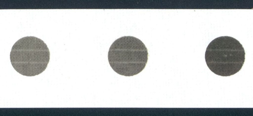
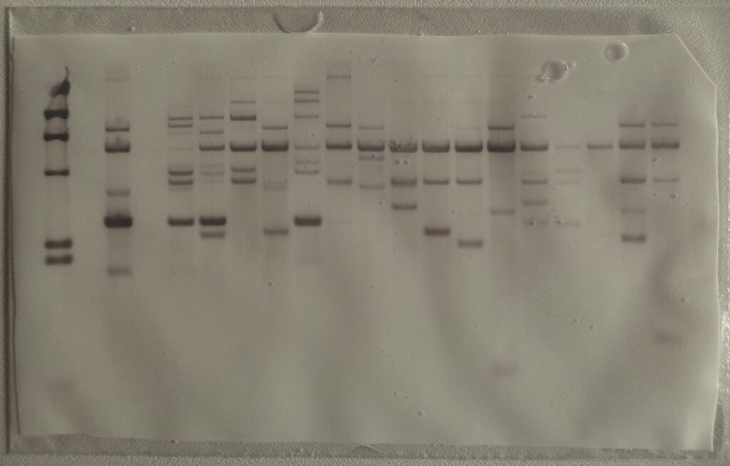
Like a prism that splits white light into its distinct wavelengths, separating means untangling a material mixture into its components. This group of operations is usually more complicated than aggregation and has been central to many experimental techniques throughout the history of science. In paper chromatography, the components of an inkblot are separated by the force of capillary action, if we dip the paper into water. DNA electrophoresis works similarly, by separating DNA fragments in an electric field.
Equivalents in data visualization:
Scatterplots and heat maps are forms of aggregation in data visualization, requiring the careful adjustment of opacity and color gradients to reveal the relevant patterns. Scatterplot matrices and parallel coordinate plots are examples of separation; spatially organizing multiple data dimensions.
3. Trace-making
Many phenomena, however, are non-visual or not accessible to the human senses. Here, the common strategy is to observe the visual interaction with a second phenomenon, often called an indicator, marker, or tracer. Often, an ephemeral phenomenon needs to be preserved before it disappears. Most analog visualization techniques are forms of trace-making, their visual appearances preserved in contemporary visual languages of data visualization.
Coupling
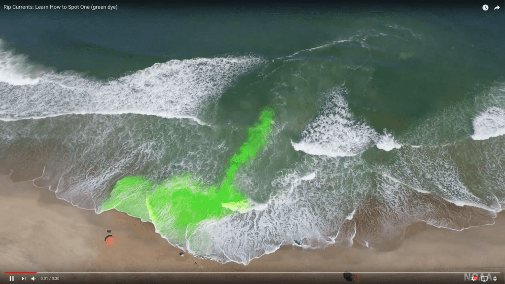
Coupling means linking an invisible phenomenon with a second one to create a visible indicator. Wind itself may be invisible, but reveals itself in the movement of grass; silk strings or smoke injected into a wind tunnel serve the same purpose. Coupling often means adding a tracer substance, such as liquid dyes that show the movement of groundwater. Coupling also includes observational skills of using environmental indicators to predict the weather or detect pollution.
Registering
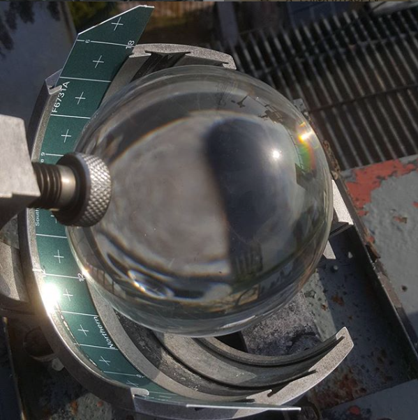
Registration is a stronger form of coupling that aims to generate a persistent record of a trace: a cast of a footprint, a record of a fingerprint, and any photographic technique. In its most elementary form, a seismograph uses a suspended pendulum, a pen, and a rotating cylinder to create a continuous trace of seismic movements. The Campbell-Stokes sunshine recorder uses a spherical lens to create burn-marks on paper to trace the movement and occlusion of the sun throughout the day. The development of self-registering instruments were a major field of innovation during the 19th century.
Equivalents in data visualization:
In many respects, data recorded by sensors, stored and processed by automatic algorithms are physical traces. Specifically focusing on the material aspects of digital data can be a fruitful approach to data analysis. The errors in GPS data, manifest in the blurry areas, point to places with tall buildings that interfere with the satellite signal. The two-dimensional data implicitly contains information about the three-dimensional shape of the city, if we take the materiality of data into account.
4. Measuring
The last step involves design interventions that guide the interpretation of traces, make it possible to compare them across time and space and quantify their features. This can involve many forms, from manual annotations, visual guides and legends, to scales that allow encoding the trace into symbolic data.
Annotating
We may find manual scribbles where traces and records of measurements are interpreted — highlighting relevant features on an x-ray, adding paint marks on the site of a road accident, or completing faint shapes on archeological artifacts. These scribbles are in some sense also traces of a thought process or collective discourse. Annotations help non-experts see the relevant features in displays of forensic evidence or archeological artifacts.
More examples of annotations on roadside accident scenes.
Encoding
Encoding represents the last step in translating a phenomenon into discrete digital data. Phenomena have countless qualities and features, while a datum is reduced to a single aspect. Encoding begins by marking different states over time; for example, the high water mark on a building. The construction of a systematic scale for reproducible observations can be a complex undertaking — documented by Christian Fahrenheit as he tried to make his temperature scale reproducible for different manufacturers.
Equivalents in data visualization:
The practice of annotation by designers and users is identical in the domain of information design and visualization, where charts are printed, annotated, and passed around. Quantitative and qualitative scales form the bridge between the discrete space of digital data and the continuous space of analog phenomena. They play a central role in making data production legible and accountable.
Autographic Systems
The operations described in the previous sections do not exist in isolation; they are combined to form autographic systems. The simple example of the cyanometer involves the two operations of framing and encoding. The liquid thermometer uses framing to focus on temperature as the quality of interest, coupling to select the thermal expansion of alcohol or mercury as an indicator, adjusts the scale of the effect through the diameter of the tube, and adds a discrete scale to facilitate encoding.
Autographic systems can take many forms and serve different purposes. Often, as in the case of the wind tunnel, they are enclosed environments, isolated from their surroundings to allow the phenomenon unfold and register in a reproducible manner. They include historical analog visualizations such as the model of the Mississippi watershed to predict the effects of flooding. Autographic systems can be combined with digital components, using the latter for introducing external data or to read out the state of the system. An interesting and growing area involves the design of smart materials with autographic properties, with many applications such as 4d printing, micro-fluidic robots, or the use and manipulation of bacteria to visualize environmental properties.
What is the relevance of autographic visualization today?
Considering the central role of digital information for our everyday experience and the fact that most analog visualization methods have been replaced by digital technology, is autographic visualization even relevant today? I would not advocate for abandoning digital visualizations to return to the ways 18th century natural philosophers studied the world. In a time when digital information is taken for granted, its relationship to the world is increasingly coming under scrutiny. There are several examples of practices where autographic visualization plays an important role:
Evidentiary aesthetics in grassroots science:
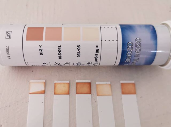
Groups such as the Public Lab who monitor environmental health hazards in affected communities frequently use autographic methods for data collection and presentation, as with a method for measuring H 2 S emissions from fracking using photo paper. Citizen scientists depend on the engagement of a community for data collection, it is therefore key that the participants understand the phenomenon. Methods like the photo paper sensor facilitate the experience of causality and produce convincing material evidence.
Photopaper Testing method for H2S emissions close to fracking sites. Source: The Public Lab
2. Performative Mapping and Annotated Walkthroughs
It is useful to investigate cases where practitioners could easily use classic visualization methods, but choose not to. The anonymous online collective of crisis mappers track the disasters and conflicts using online material: social media posts, cell-phone and drone footage, or satellite images. They cross-reference their source material to determine the time and location of certain events. They could publish maps and visualizations with their findings, but they often chose to arrange and annotate their source materials instead. This strategy forces the viewer to do the work of a cartographer and connect the dots. This approach to present evidence is a sensible choice for groups whose findings often face doubt, controversy, and resistance.
Amateur conflict mappers arrange and annotate source material to emphasize the authenticity of their data sources. Source: IUCAnalysts Twitter
3. Sensory Accountability
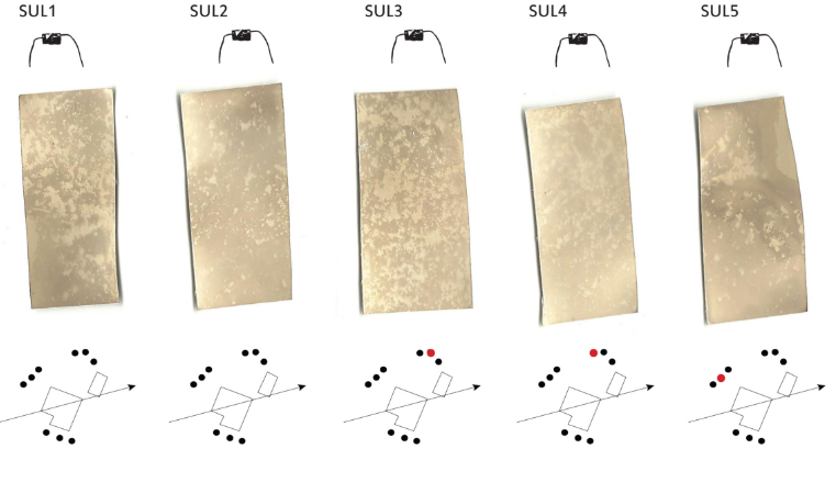
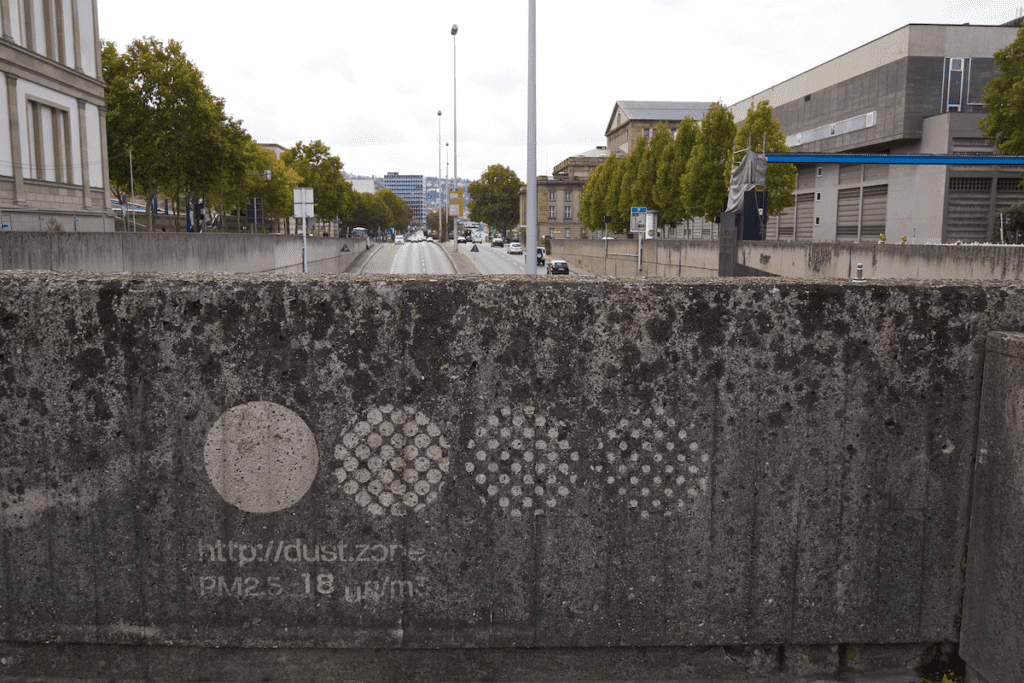
Not just the work of amateur experts, but also official data collection methods are not above controversy. Air pollution through particulate matter is a complex phenomenon that is only insufficiently captured by current standards of measurement. Airborne particulate matter is invisible, and the PM10 and PM2.5 metrics are difficult to connect with everyday experience. At the same time, the whole city is a visualization of air pollution, as dust accumulates on all surfaces. Dustmarks are visual patterns that make the urban dust patina visible and allow tracking it over time as the patterns slowly fade. In combination with the digital sensor readings, these autographic visualization invite comparison and reflection into the nature of dust pollution.
Conclusion
Autographic visualization addresses the common myth that data collection is merely a bureaucratic exercise, while data analysis is where the heroic genius enters the stage. By focusing on traces, I try to show that data collection can be a form of visual inquiry that involves complex design decisions. By engaging with the material underpinnings of data collection, autographic visualization facilitates critical reflections about how data relate to the world.
Autographic visualization considers the structures in the physical world as data and thus serves as a speculative counter-model to data visualization, which is limited to the space of symbolic representation. But its purpose is not to replace or diminish visualization practices — contrast and comparison of the two models makes their characteristics, differences, and similarities clear.
Autographic visualization requires considering the viewer as part of the visualization, because the perception of a trace depends on personal skills and experience. There is no safe assumption of visual literacy and other normative conventions, but only an invitation to be attentive and curious.